Chart Types
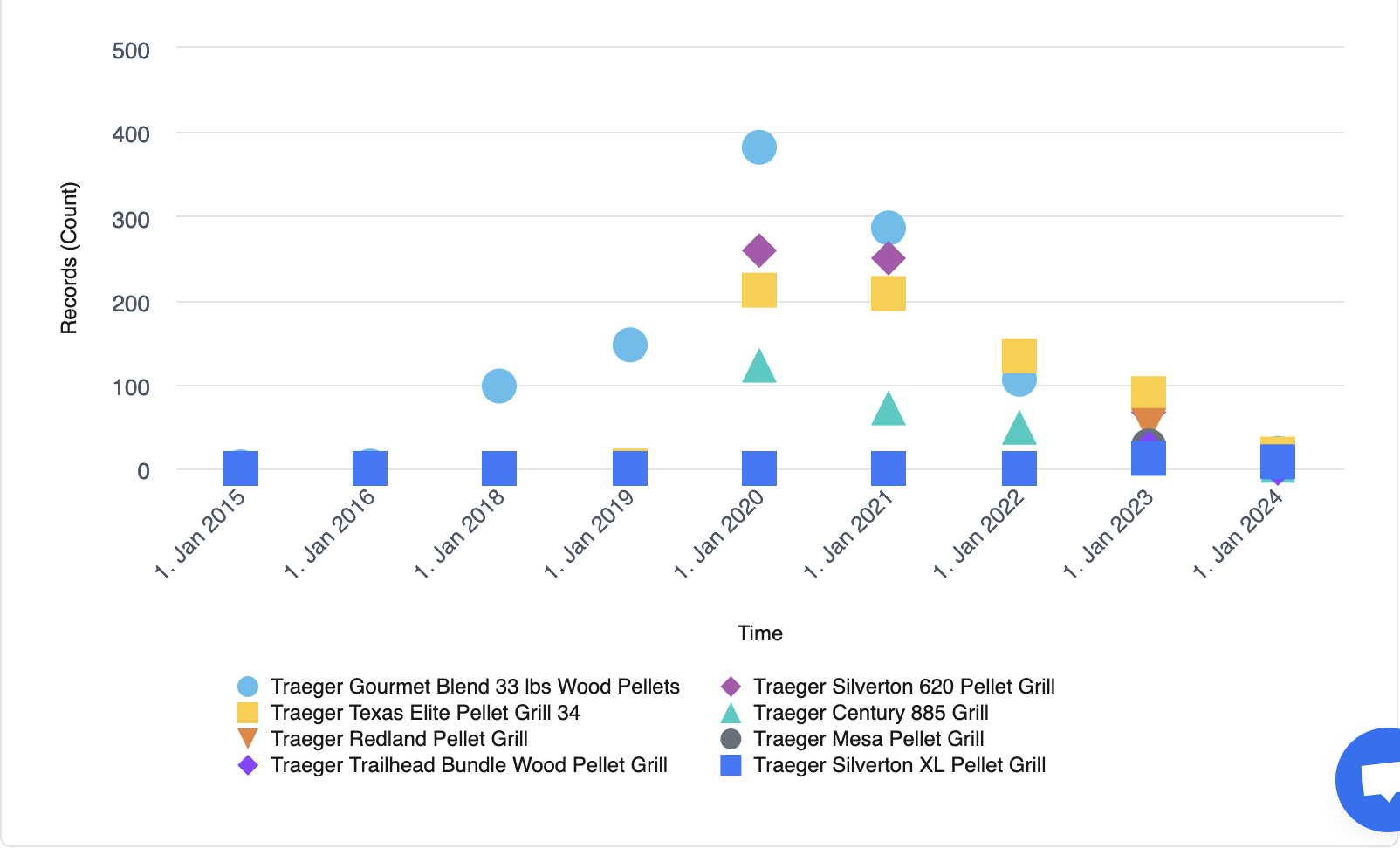
Scatter Plot
Scatter plots display data points as individual dots or markers. The position of each marker represents the values for two different metrics. One metric is mapped to the x-axis, and the other metric is mapped to the y-axis.
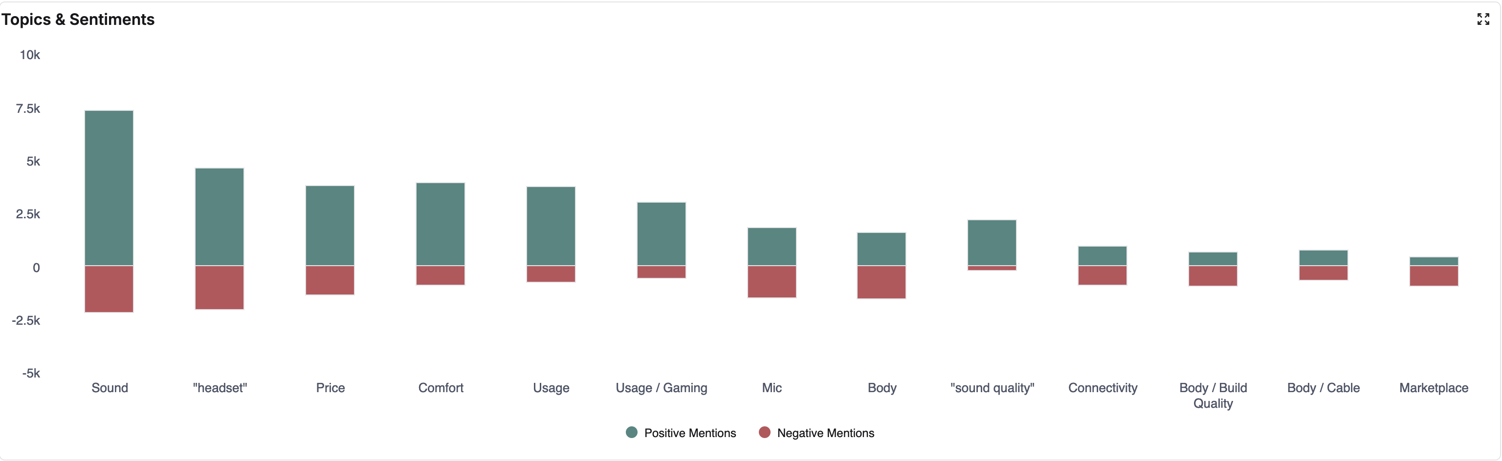
Topics Sentiment Column Chart
The stacked bar chart visualizes the sentiment analysis of various topics mentioned in reviews or feedback. The chart shows both positive and negative mentions for each topic. The topics are listed on the x-axis, while the y-axis represents the frequency or number of mentions, both positive (shown in green) and negative (shown in red).
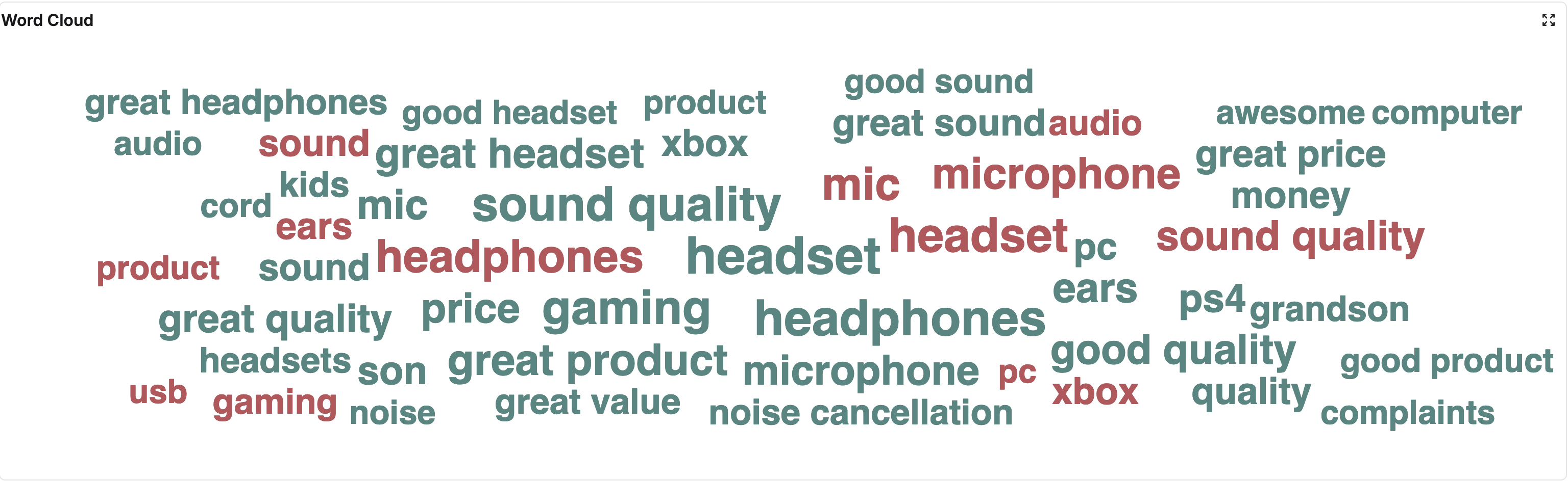
Word Cloud
A word cloud is a visual representation of text data, where words are displayed in different sizes according to their frequency or importance within a collection of reviews or feedback. Typically, the more frequently a word appears in the text, the larger and bolder it appears in the word cloud.
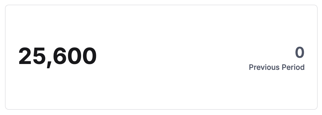
Metric Card
Metric Card can be used to display metrics with titles. Eg: Record Count - This metric shows the total number of reviews received over a specific time period.
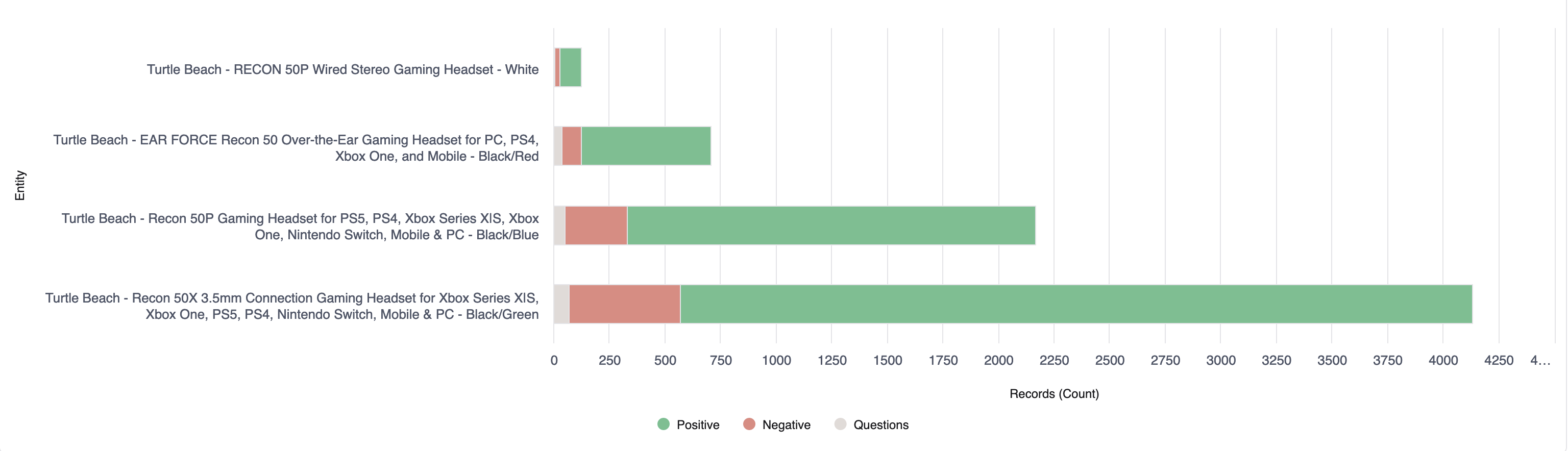
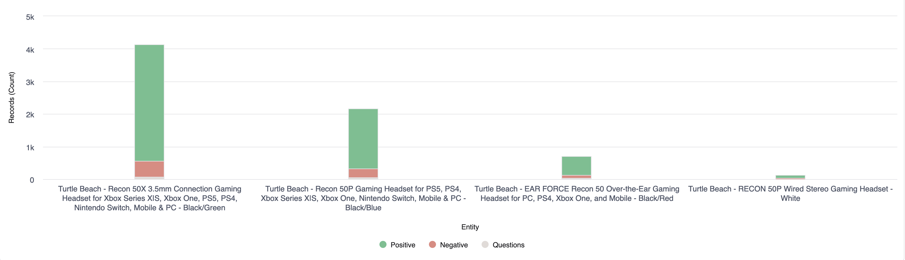
Bar Chart/Column Chart
- Bar Cart: Plots data as horizontal bars.
- Column Chart: Plots data vertically as columns.
The length or height of each bar is proportional to the value it represents. These charts are useful for comparing different categories or groups of data side by side.
Bar Chart
Column Chart
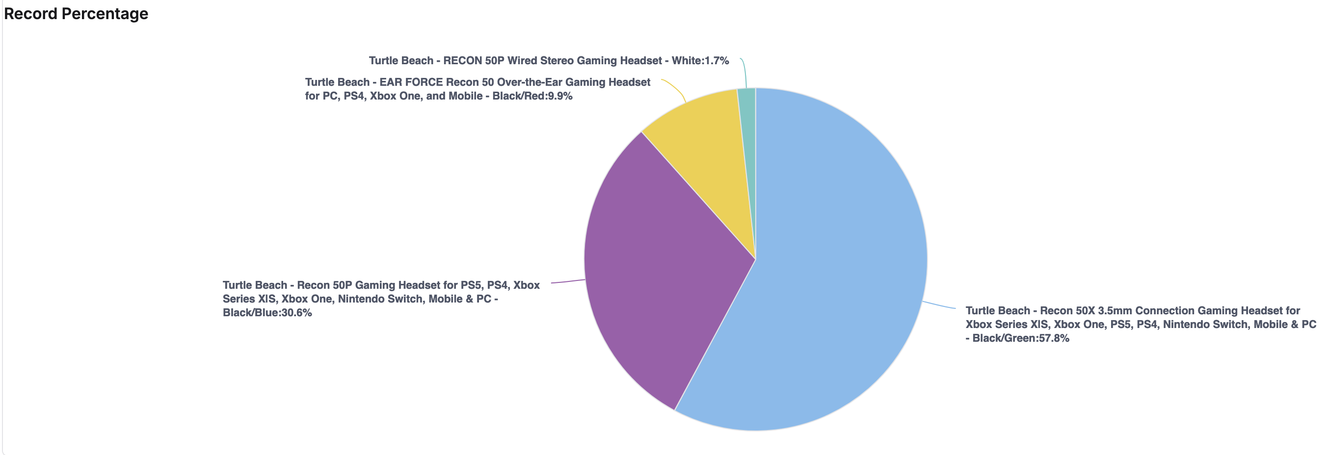
Pie Chart
A pie chart is a circular statistical graphic divided into slices, where each slice represents a segment of the data. The area of each slice is proportional to the value it represents. Pie charts are commonly used to depict the composition or percentage breakdown of a whole.
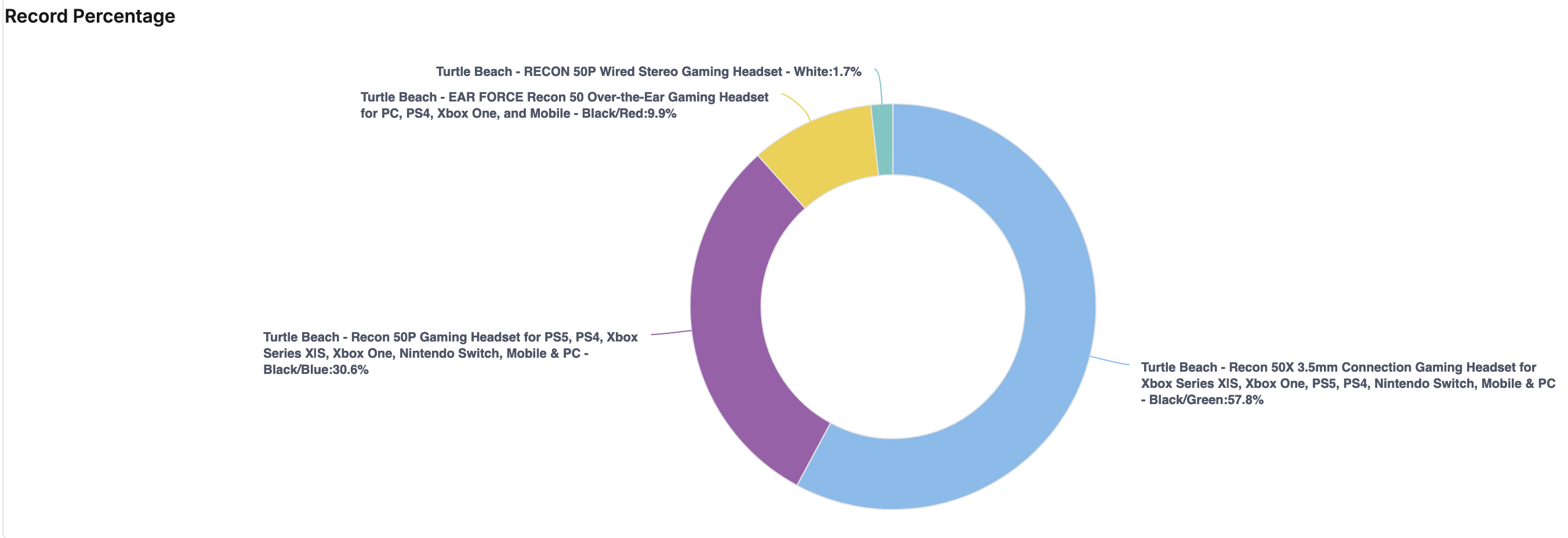
Donut Chart
A donut chart is a variation of a pie chart, with the center of the circle left blank. Like a pie chart, the donut chart displays data as slices of a circle. Donut charts can be useful when there are too many slices in a pie chart, making it difficult to distinguish between smaller segments.
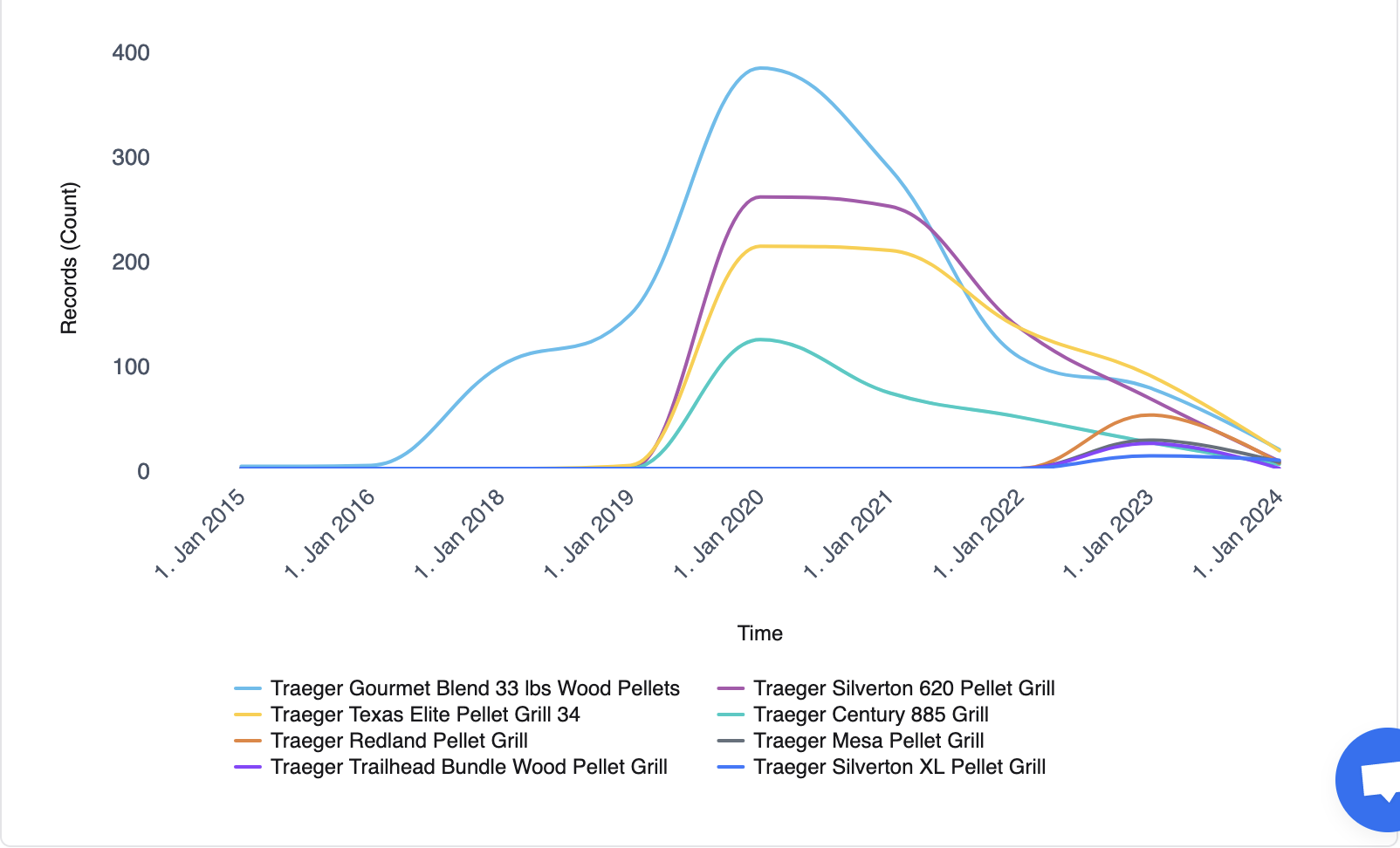
Line Chart
A line chart is a graphical representation of data points connected by straight line segments, where the x-axis typically represents a continuous dimension (e.g., time), and the y-axis represents the metrics.
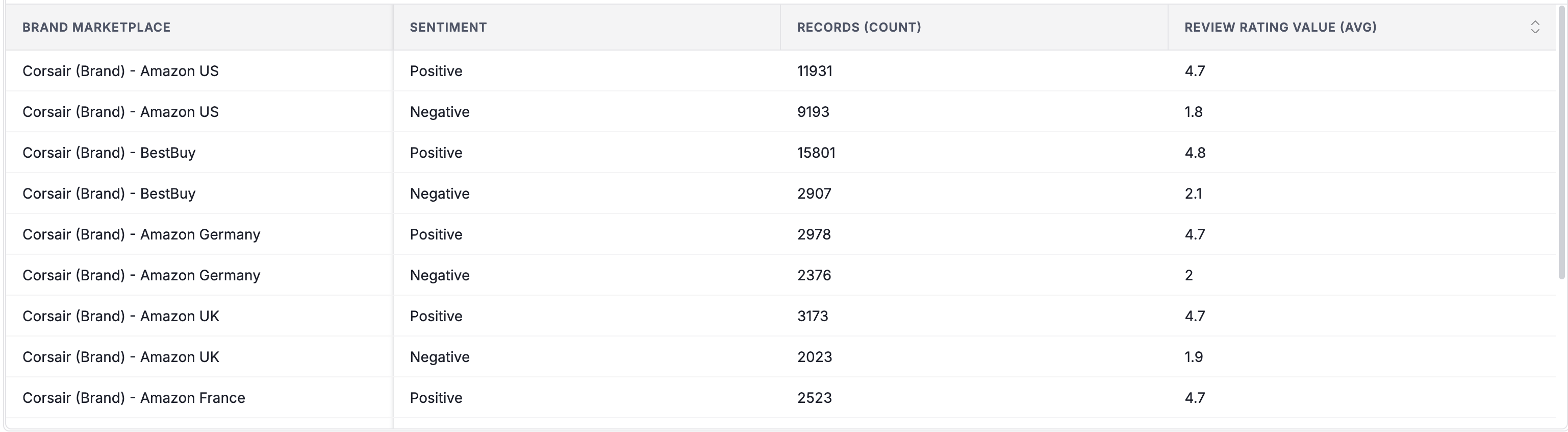
Table
A table is a visual representation of data organized in rows and columns. Dimensions are the groupings by which data is organized. For example, in a sales report, dimensions might include product categories, regions, or time periods. Metrics are the numerical measures that provide insights into the dimensions. For example, sales revenue, profit margins, or quantities sold.
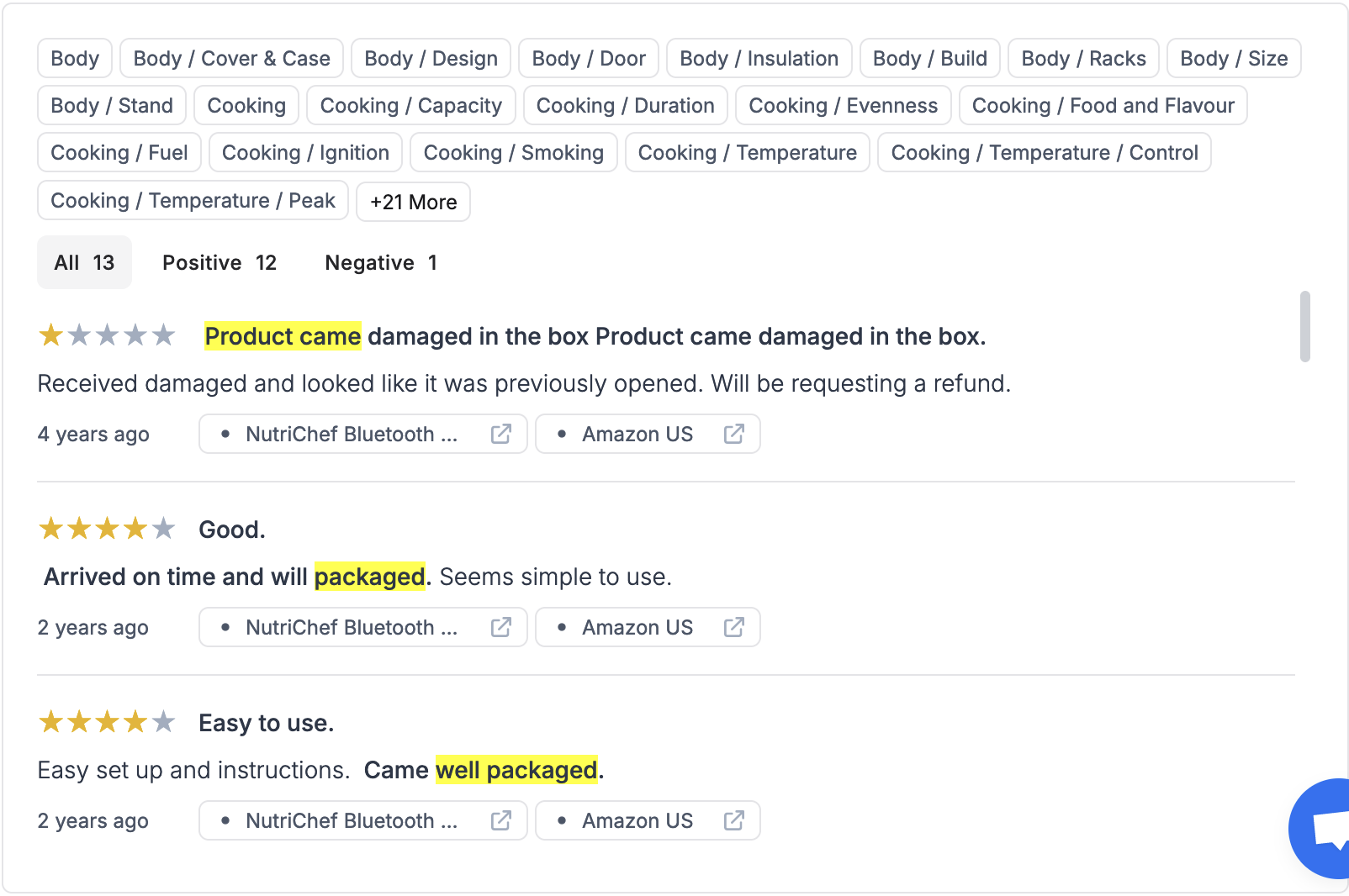
Comments Unit
The graph is a visual representation of customer reviews for a product. Clicking a topic shows all the reviews that mention the selected topic. Clicking a review opens a pop-up window displaying the complete review text and topics related to it.
Pivot Table
A pivot table summarizes large datasets into a compact tabular view, making it easier to analyze data and spot trends.
For more details, go to How to use the Pivot Table Widget.
Topics Table
The Topics Table provides a breakdown of customer sentiment (Positive, Negative, Neutral, Questions, Suggestions) categorized by various topics (specific things customers talk about in their feedback). This helps you understand what aspects of your product or service are most appealing to your customers and where there might be areas for improvement.
For more details, go to Topics Report.
Design Elements
Card: To adjust the space both around and inside the chart, you can modify the card's padding and margin values.
Legend: Legends are used in charts to explain what the different symbols or colors represent in the data.By clicking the legends, the user can show or hide the corresponding points.
-
Enable/disable legend: You can choose to enable or disable the legend entirely.
-
Layout: You can choose between a horizontal or vertical layout for the legend entries.
-
Alignment: You can choose the alignment of the legend relative to the chart. For horizontal alignment, you can choose left, center or right alignment. For vertical alignment, you can choose top, middle or bottom alignment.
-
Offset: You can set the horizontal or vertical offset of the legend from its default position.
Axis: The menu allows you to configure the X and Y axes.
-
Title: You can set a title for the axis.
-
Opposite side of chart: You can choose whether to display the axis on the opposite side of the chart from its usual position.
-
Reversed: You can choose whether to reverse the order of the labels on the axis.
Exporting: This option allows you to configure exported images.
-
Enable Exporting: This checkbox enables or disables the exporting functionality altogether.
-
Exported Width: This field allows you to specify the width, in pixels, of the exported image.
-
Scaling Factor: This field allows you to specify a scaling factor to apply to the exported image. A value of 1 would result in no scaling. A value greater than 1 would enlarge the image, and a value less than 1 would shrink it.
Series Colors: This allows you to configure the colors used to represent different data points in a graph.
Table Controls: Toggle to show/Hide Search bar.
Row: Select "Row Limit" value to control the number of displayed rows.
Column: Adds visualizations to columns.
-
Show Volume Bar: This option enables visualization of column values with horizontal bars. When selected, it adds volume bars alongside each item in the column.
-
Volume Bar Color: This option is enabled only when "Show Volume Bar" is checked. It lets you select the color for the volume bars.
-
Show Change: This option displays the difference or percentage change between values in the selected column compared to a previous period.
-
Show Change Background: This option, when enabled, applies conditional formatting to the background color of the cells based on the sign of the percentage change. Positive percentage changes (increases) typically display with a green background. Negative percentage changes (decreases) typically display with a red background.