How to use the Pivot Table Widget
Introduction to Pivot Table
A pivot table summarizes large datasets into a compact tabular view, making it easier to analyze data and spot trends.
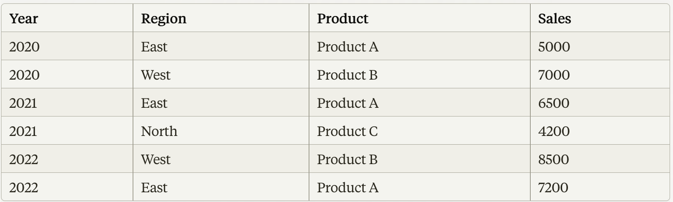
To understand this better, let's Look at an example. Suppose we have a dataset containing sales data for different products sold across multiple regions and years. The raw data might look something like this:
To create a pivot table from this data, add Region as Rows, Product as Column, Total sales as values. After these steps, the pivot table might look something like this:
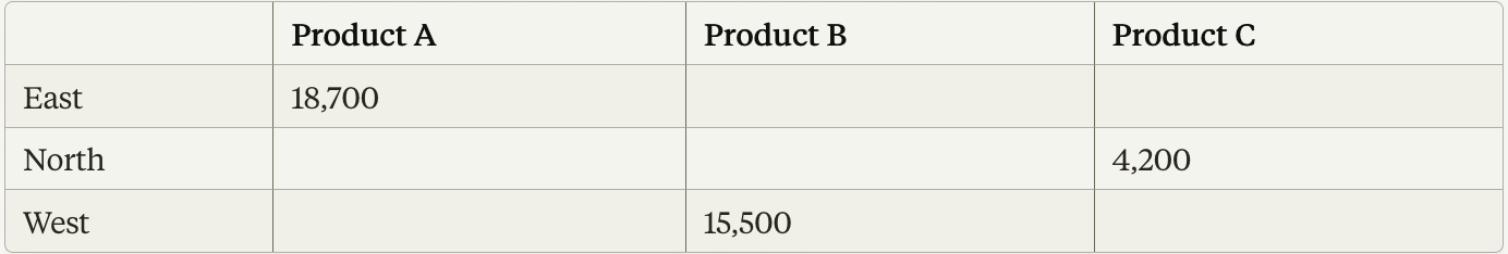
In this example, the pivot table summarizes the total sales for each product across different regions. You can quickly see that Product A had total sales of $18,700 in the East region, Product B had total sales of $15,500 in the West region, and Product C had total sales of $4,200 in the North region.
Building a Pivot Table on Freetext.AI
Similarly, in Freetext.ai, you can build pivot tables to summarize customer feedback. Start by selecting the data you want to analyze, then choose how to categorize it with Row and Column Dimensions and what information to highlight (metrics). For detailed instructions on how to add a pivot table to a new report, visit the Create Widget section of our documentation.
Dimensions
Dimensions are characteristics that add context to your metrics. They help categorize and group data for analysis. Dimensions can be time, geographical location, product categories, customer segments, or marketing channels. Select dimensions to break down your metrics into categories.
Row and column dimensions categorize and organize data hierarchically, based on selected categories, with the option to select up to six categories for each dimension. The row dimensions create groupings or partitions of the data, while column dimensions create sub groupings within those row groups.
Metrics
Metrics are numerical measurements that represent different aspects of business. They provide specific data points like Records Count, product ratings, customer satisfaction score, Impact Score, etc. Each cell presents the metric value corresponding to the specific combination of categories defined by the row and column dimensions. You can select up to 6 metrics.
To learn more about each dimension and metric, go to Metrics & Dimensions.
Filters
You can use filters to focus on specific subsets of data within your pivot table. Eg. If Time is selected as either the row or column dimension, you can use the Time and Graph Filters to refine the data further.
Example
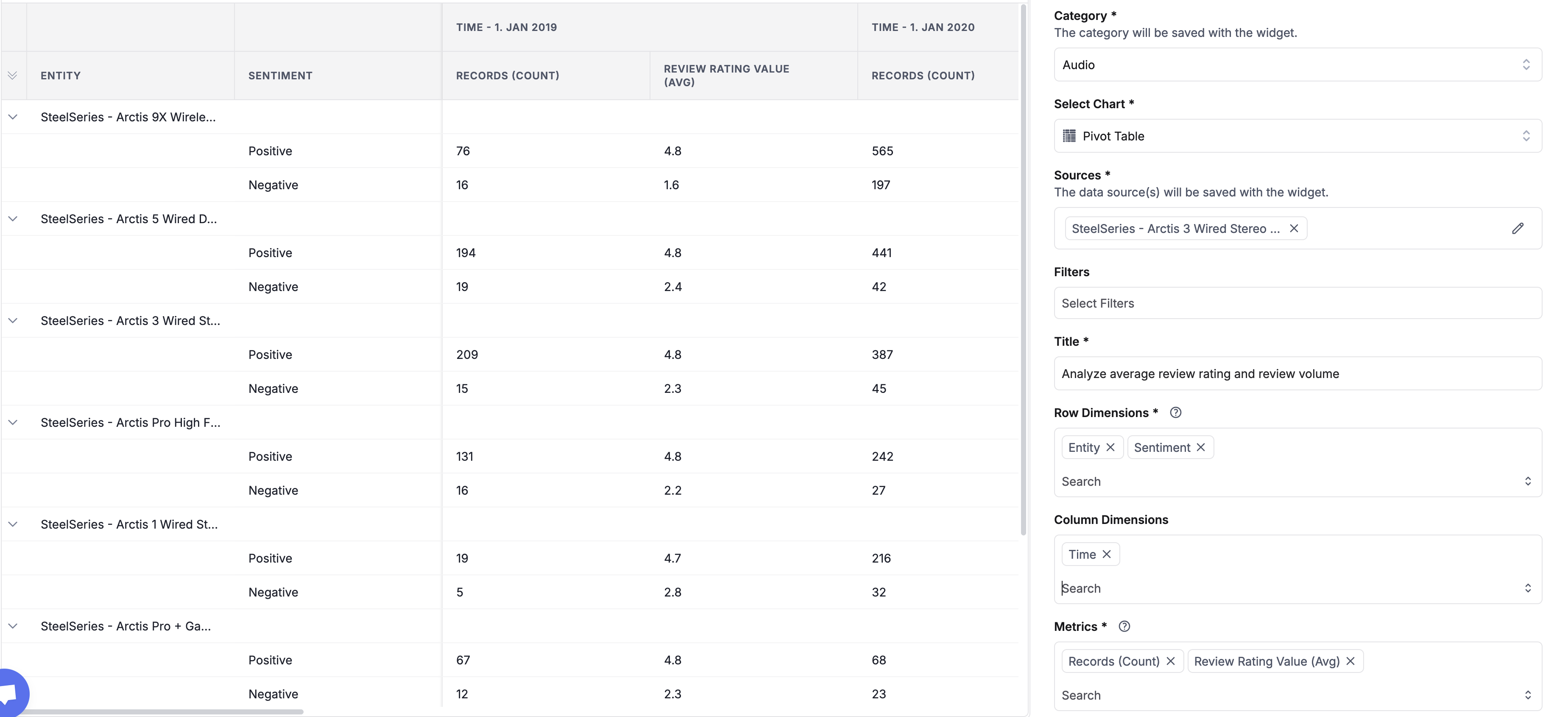
To illustrate the usage of pivot tables in Freetext.ai, let's consider a scenario where we want to analyze the average review rating and review volume for different products of a brand across various sentiment polarities (positive, negative, or neutral).
Row Dimensions:
- Entity
- Sentiment
Column Dimensions:
- Time
Metrics:
- Records(Count)
- Review Rating Value(Avg)
With these dimensions and metrics, the pivot table would look like this:
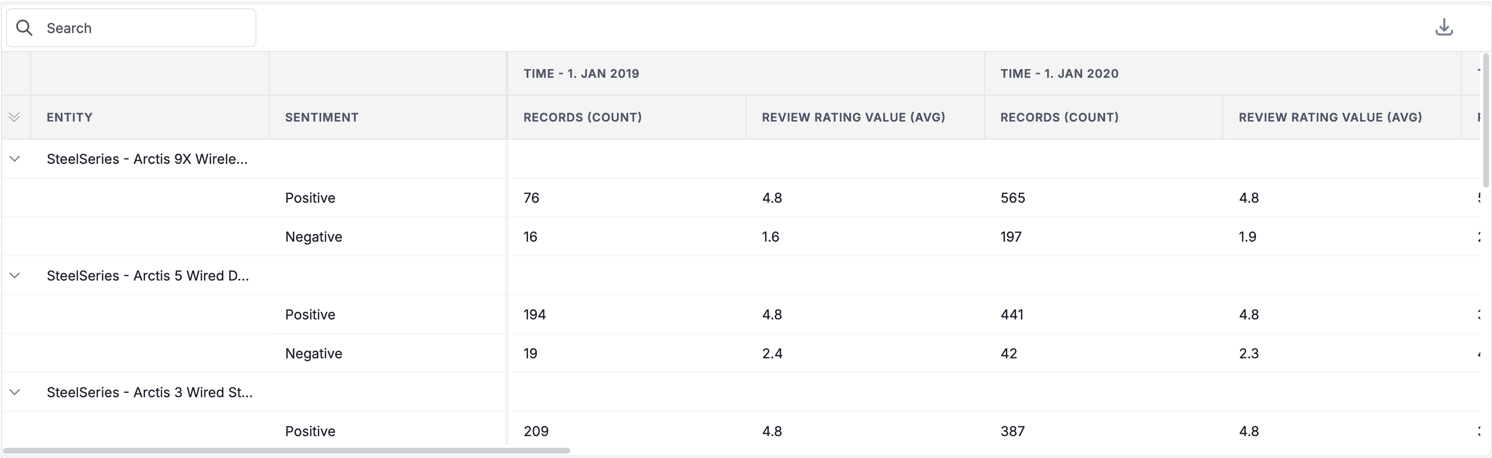
The intention behind creating this pivot table is to gain insights into the following:
- Identify the products that are performing well or poorly in terms of customer satisfaction, as indicated by the average review rating value for positive, negative, and neutral sentiments.
- Understand the distribution of review volume (record count) across different sentiment polarities for each product.
- Analyze trends over time by looking at the year-over-year changes in average review ratings and review volume for each product and sentiment polarity.
Sorting
When the table has loaded, you can choose to sort it by a single column by clicking on the row/column name.
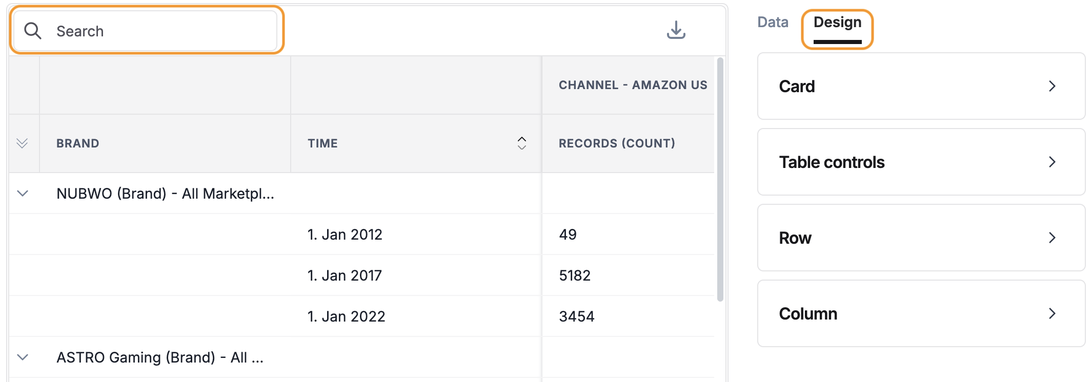
Design
To customize the appearance of the pivot table, click on the "Design" tab located in the right-hand-side panel.
- Card: To adjust the spacing around the edges of the pivot table, change the value of the card padding.
- Table Controls: Toggle to show/Hide Search bar.
- Row: Select "Row Limit" value to control the number of displayed rows.
- Column: Adds visualizations to columns.
- Show Volume Bar: This option enables visualization of column values with horizontal bars. When selected, it adds volume bars alongside each item in the column.
- Volume Bar Color: This option is enabled only when "Show Volume Bar" is checked. It lets you select the color for the volume bars.
- Show Change: This option displays the difference or percentage change between values in the selected column compared to a previous period.
- Show Change Background: This option, when enabled, applies conditional formatting to the background color of the cells based on the sign of the percentage change. Positive percentage changes (increases) typically display with a green background. Negative percentage changes (decreases) typically display with a red background.
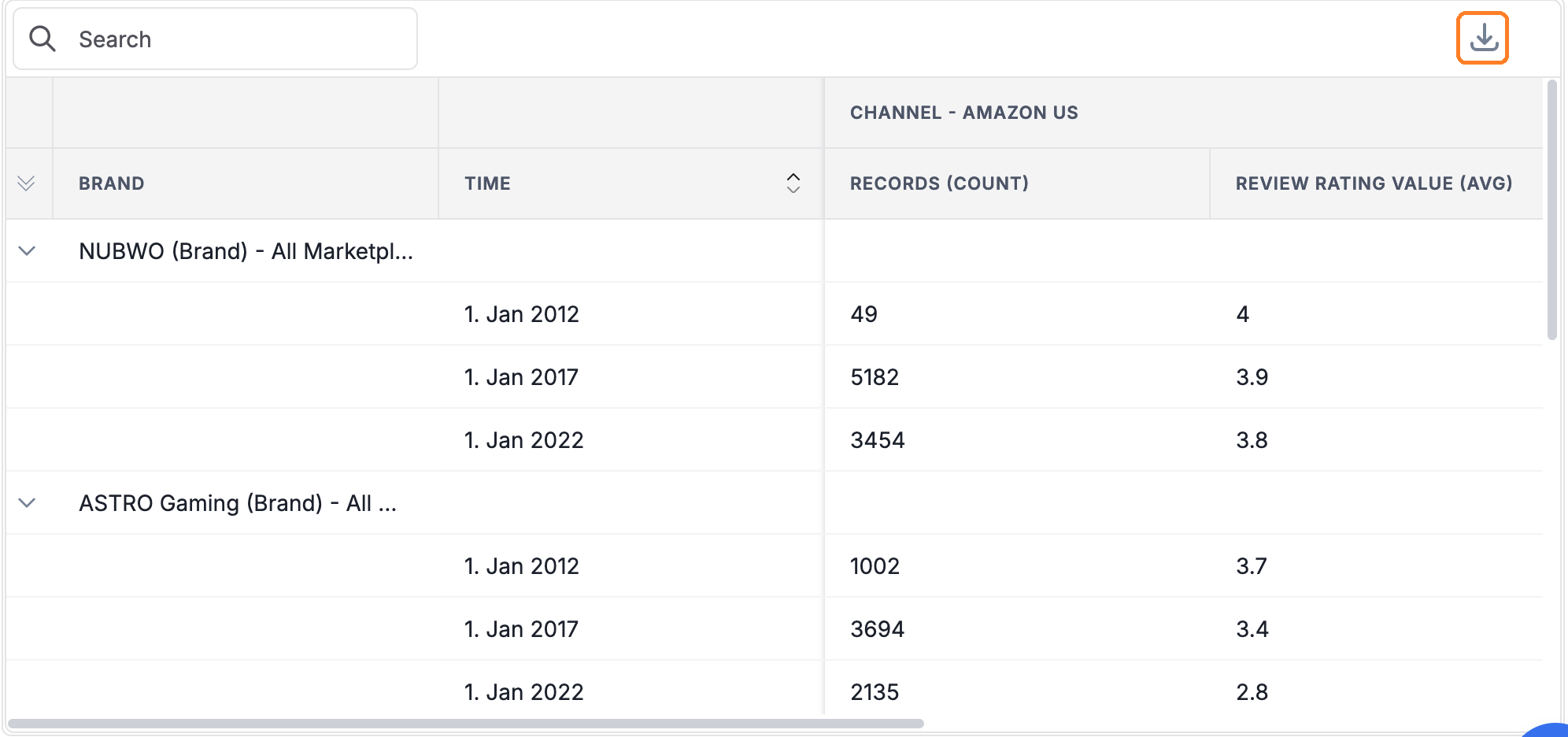
Download
Click on the download button to download as a CSV file.